Our short knowledge bytes help you build skills on Data Science
✨ What Is Data Science ?
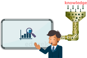
Data science encompasses the usage of scientific methods, statistics, artificial intelligence, and data analysis, to extract information and insights from structured and unstructured data and apply actionable insights.
Data Science includes preparing data for analysis, including cleansing, aggregating, and manipulating the data to perform advanced data analysis. Analytic applications and data scientists can then review the results to uncover patterns and enable business leaders to draw informed insights.
Data Science helps us in finding patterns in data, through analysis, and making future predictions.
By using Data Science, companies are able to make:
- Better decisions (choose A or B)
- Predictive analysis (what happens next?)
- Pattern discoveries (finding patterns or hidden information in the data)
✨ Life cycle of Data Science
Here is a brief overview of the main phases of the Data Science Lifecycle:
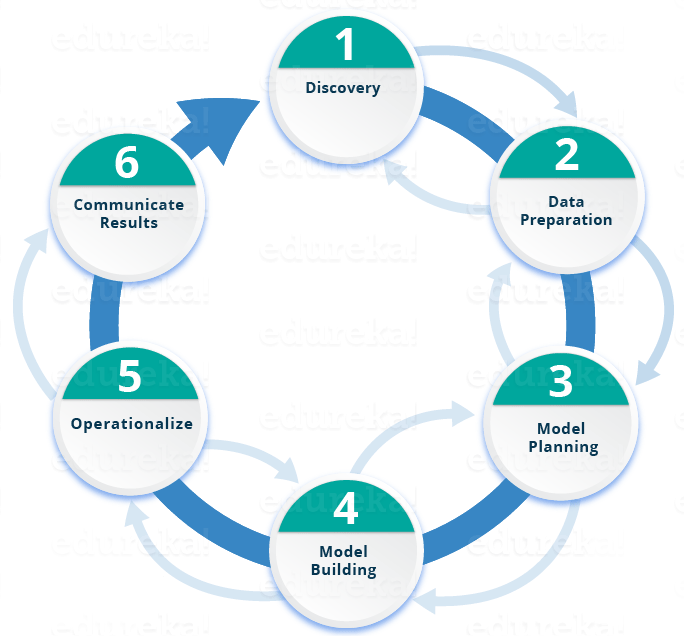
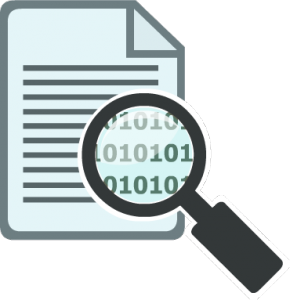 Phase 1—Discovery: Before you begin , it is important to understand the various specifications, requirements, priorities and required budget. You must possess the ability to ask the right questions. Here, you assess if you have the required resources present in terms of people, technology, time and data to support the project. In this phase, you also need to frame the business problem and formulate initial hypotheses (IH) to test.
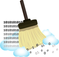
Phase 2—Data preparation: In this phase, you require analytical sandbox in which you can perform analytics for the entire duration of the project. You need to explore, preprocess and condition data prior to modeling. Further, you will perform ETLT (extract, transform, load and transform) to get data into the sandbox. Let’s have a look at the Statistical Analysis flow below.

You can use R for data cleaning, transformation, and visualization. This will help you to spot the outliers and establish a relationship between the variables. Once you have cleaned and prepared the data, it’s time to do exploratory analytics on it. Let’s see how you can achieve that.
Phase 3—Model planning:  Here, you will determine the methods and techniques to draw the relationships between variables. These relationships will set the base for the algorithms which you will implement in the next phase. You will apply Exploratory Data Analytics (EDA) using various statistical formulas and visualization tools.
Let’s have a look at various model planning tools.
- R has a complete set of modeling capabilities and provides a good environment for building interpretive models.
- SQL Analysis services can perform in-database analytics using common data mining functions and basic predictive models.
- SAS/ACCESS can be used to access data from Hadoop and is used for creating repeatable and reusable model flow diagrams.
Although, many tools are present in the market but R is the most commonly used tool.
Now that you have got insights into the nature of your data and have decided the algorithms to be used. In the next stage, you will apply the algorithm and build up a model.
 Phase 4—Model building: In this phase, you will develop datasets for training and testing purposes. Here you need to consider whether your existing tools will suffice for running the models or it will need a more robust environment (like fast and parallel processing). You will analyze various learning techniques like classification, association and clustering to build the model.
Phase 5—Operationalize: 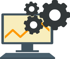 In this phase, you deliver final reports, briefings, code and technical documents. In addition, sometimes a pilot project is also implemented in a real-time production environment. This will provide you a clear picture of the performance and other related constraints on a small scale before full deployment.
 Phase 6—Communicate results: Now it is important to evaluate if you have been able to achieve your goal that you had planned in the first phase. So, in the last phase, you identify all the key findings, communicate to the stakeholders and determine if the results of the project are a success or a failure based on the criteria developed in Phase 1.
✨ What Is Data ?
Data is a collection of information.
Using Data Science we can structure the data, making it easy to work and interpretable.
Data can be categorized into two groups:
- Structured Data: Structured data is organized and easier to work with. It stands for information that is highly organized, factual, quantified and accurately formatted. Structured data commonly exists in the forms of tables similar to excel files and spreadsheets.
- Unstructured Data: Unstructured data is not organized. It doesn’t have any pre-defined structure and comes in diverse forms. Examples of unstructured data are email, text files, social media posts, video, images, audio, sensor data comprising of media and entertainment data, surveillance data, geo-spatial data, audio, weather data.
How to Structure Data?
We can use an array or a database table to structure or present data.
Array = [80, 85, 90, 95, 100, 105, 110, 115, 120, 125]
print(Array)
✨ Top Data Science Tools
The fields of data science and artificial intelligence see constant growth. As more industries find value in automation, analytics, and insight discovery, there comes a need for the development of new tools, frameworks, and libraries to meet increased demand
There are some tools that seem to be popular year after year, but some newer tools emerge and quickly become a necessity for any practicing data scientist. As such, here are ten trending data science tools that you should have in your repertoire in 2021.
PyTorch
PyTorch can be used for a variety of functions from building neural networks to decision trees due to the variety of extensible libraries including Scikit-Learn, making it easy to get on board. Importantly, the platform has gained substantial popularity and established community support that can be integral in solving usage problems. A key feature of Pytorch is its use of dynamic computational graphs, which state the order of computations defined by the model structure in a neural network for example.
Scikit-learn
Scikit-learn has been around for quite a while and is widely used by in-house data science teams. Thus it’s not surprising that it’s a platform for not only training and testing NLP models but also NLP and NLU workflows. In addition to working well with many of the libraries already mentioned such as NLTK, and other data science tools, it has its own extensive library of models. Many NLP and NLU projects involve classic workflows of feature extraction, training, testing, model fit, and evaluation, meaning scikit-learn’s pipeline module fits this purpose well.
Tensorflow
Tensorflow is often used for solving deep learning problems and for training and evaluating processes up to the model deployment. Apart from machine learning purposes, TensorFlow can be also used for building simulations, based on partial derivative equations. That’s why it is considered to be an all-purpose and one of the more popular data science tools for machine learning engineers.
Airflow
Apache Airflow is a data science tool created by the Apache community to programmatically author, schedule, and monitor workflows. The biggest advantage of Airflow is the fact that it does not limit the scope of pipelines. Airflow can be used for building machine learning models, transferring data, or managing the infrastructure. The most important thing about Airflow is the fact that it is an “orchestrator.” Airflow does not process data on its own, Airflow only tells others what has to be done and when.
Kubernetes
Kubernetes is an open-source system for automating deployment, scaling, and management of containerized applications. It groups containers that make up an application into logical units for easy management and discovery.
Pandas
Pandas is a popular data analysis library built on top of the Python programming language. Pandas assists with common manipulations for data cleaning, joining, sorting, filtering, deduping, and more. It was released in 2009 and now sits as the center of Python’s large data science ecosystem and is considered as an essential tool for modern data analysis.
✨Top Python Data Visualization Libraries
If you’re new to Python visualization, you may be overwhelmed with the number of libraries out there. This guide will walk you through the unique features, pros, and cons of each library and let you decide which one should you pick
1. matplotlib
From beginners in data science to experienced professionals building complex data visualizations, matplotlib is usually the default visualization Python library data scientists turn to. Despite being over a decade old, it’s still the most widely used library for plotting in the Python community. matplotlib is known for the high amount of flexibility it provides as a 2-D plotting library in Python.
matplotlib supports all the popular charts, lots, histograms, power spectra, bar charts, error charts, scatterplots, etc. There are also extensions that you can use to create advanced visualizations like 3-Dimensional plots, etc.
2. Seaborn
Seaborn is built on top of matplotlib and provides a very simple yet intuitive interface for building visualizations. It provides a higher-level wrapper on the library which makes it easier to create more aesthetically pleasing plots. The key difference is Seaborn’s default styles and color palettes, which are designed to be more aesthetically pleasing and modern. Since Seaborn is built on top of matplotlib, you’ll need to know matplotlib to tweak Seaborn’s defaults.
The first unique feature of Seaborn is that it is designed in such a way that you write way lesser code to achieve high-grade visualizations. The second useful feature of Seaborn is that it supports a plethora of advanced plots like categorical plotting (catplot), distribution plotting using kde (distplot), swarm plot, etc. right out of the box.
3. ggplot
ggplot is based on ggplot2, an R plotting system, and concepts from The Grammar of Graphics. ggplot operates differently than matplotlib: it lets you layer components to create a complete plot. For instance, you can start with axes, then add points, then a line, a trendline, etc. Although The Grammar of Graphics has been praised as an “intuitive” method for plotting, seasoned matplotlib users might need time to adjust to this new mindset.
ggplot is also a declarative style library like Bokeh but is also tightly coupled with Pandas. This means you can easily build visualizations using your Pandas dataframe itself!!
4. Altair
Altair is a declarative statistical visualization library for Python. It’s got a great API, and it’s ideal for plots that require a lot of statistical transformation. Altair is a declarative library for data visualization. Its principle is that rather than focusing on the code part, one should focus on the visualization part and write as less code as possible and still be able to create beautiful and intuitive plots.
Since Altair uses a declarative style to create plots, it becomes very easy and quick to iterate through visualizations and experiments at a rapid pace when using this library.
Altair’s API is easy to understand and also makes it really easy to transform the data while creating the chart.
5. Plotly
Plotly’s Python graphing library makes it easy to create interactive, publication-quality graphs. It can also create similar charts as Matplotlib and seaborn such as line plots, scatter plots, area charts, bar charts, etc. Plotly is highly compatible with Jupyter Notebook and Web Browsers. This means whatever interactive plots you create can easily be shared in the same manner with your teammates or end-users.
Plotly supports a gamut of plots right from basic chart types, Seaborn-like beautiful and advanced plots, 3-D plots, Map-based visualizations, scientific plots, etc. The list is endless!
Plotly’s plots can also support animation capabilities as well. So, it’s a pretty useful library if you want to do storytelling through visualizations.
6. Bokeh
Bokeh is a flexible interactive visualization library that targets web browsers for representation. If we will rank among the interactive visualization libraries above, Bokeh’s API will probably rank first in regards to the similarity to Matplotlib.
Matplotlib can create any plot because it is so low-level, but Bokeh can be both used as a high-level or low-level interface; thus, it can create many sophisticated plots that Matplotlib creates but with fewer lines of code and a higher resolution. Using Bokeh, you can create this with better resolution and more interactivity: Similarly to Altair, with Bokeh it’s also easy to link between plots. This means that the change applied in one plot will be applied to another plot with a similar variable.